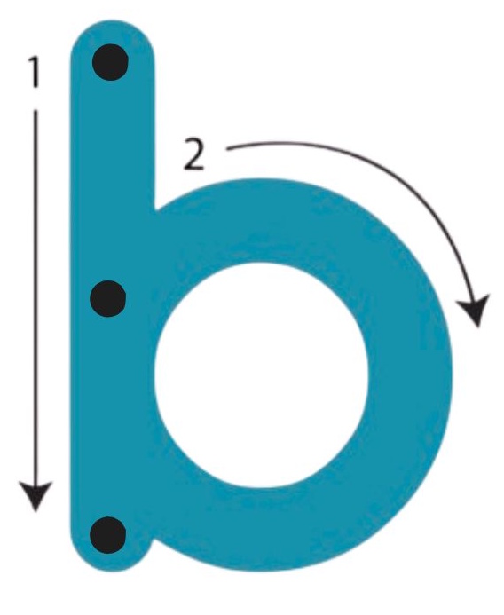
The common “ball-and-stick” handwriting style that is often taught to young children, breaks letters down into simple shapes. Round “balls” for circles and straight “sticks” for lines. For example, the letter b is written with a straight vertical line, followed by a pencil lift to draw a circle at the top. Each letter is formed by the two same basic shapes. The simplicity sounds appealing at first, but letter reversals (where a child confuses the b with d and p with q) are very common with this handwriting style, and there are indicators that it may even contribute to dyslexia.
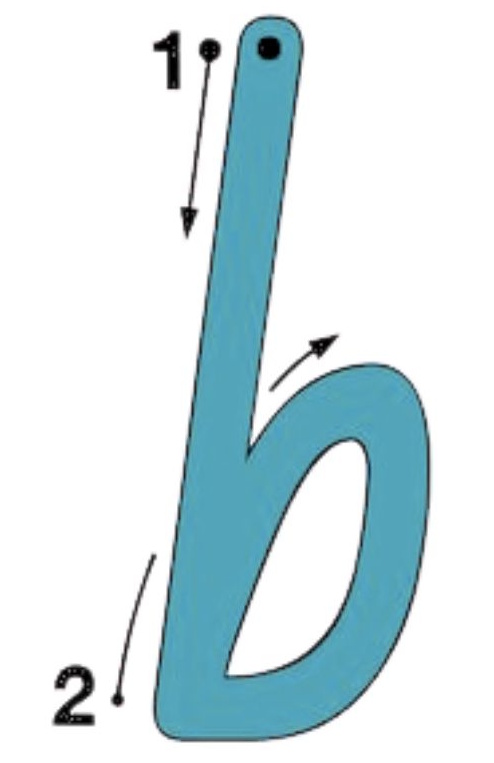
In contrast, italic handwriting uses a “continuous stroke” method, which allows the majority of letters to be formed without lifting the pencil in distinct, uninterrupted movements. For example, the b is taught by starting at the top line, creating a vertical stroke to the base line, and then moving up in a circular motion without lifting the pencil to complete the letter formation. These continuous movements help the child develop muscle memory for the specific movement patterns of letters. This builds a robust physical memory and strengthens neural pathways, helping the child to more easily recall the form of the letter, regardless of how similar it looks to another letter.
The italic font we use in foundational Phonics is called NSW Foundation. It is actually one of a handful of specific fonts that are approved to be taught in the Australian schools, for the same reason. Each region is required to teach progressive cursive handwriting.
We chose this font because it is able to beautifully transition from a simple manuscript to legible cursive by simply adding joins, rather than requiring children to start over with a whole new set of shapes in order to begin learning cursive.
The varied fonts found at the top of each page in Letter Mastery are part of this program’s multisensory approach. By gently exposing children to the fact that letters can vary in style yet remain the same, we broaden their ability to recognize the many different forms that letters assume in the real world.
As each letter is explored, these “fancy” fonts become quiet reinforcements, helping children make connections to the letters they encounter all around them. In an age when very little handwritten communication takes place after the formative years, it should be a priority to make sure children can recognize more than basic fonts.